logo | branding | website
the alexander
George Oliver, a developer of co-working spaces throughout the Western US, came to Rethinc Advertising with a vision of a sleek and luxurious brand identity for their new concept, The Alexander and their adjacent neighboring space, The Johnathan.
I designed a unique logotype and brand identity to align with George Oliver's mission of providing a space that communicates quality and intention. This new office workspace would help to redefine the up-and-coming city with a young and innovative crowd of business owners and workers.
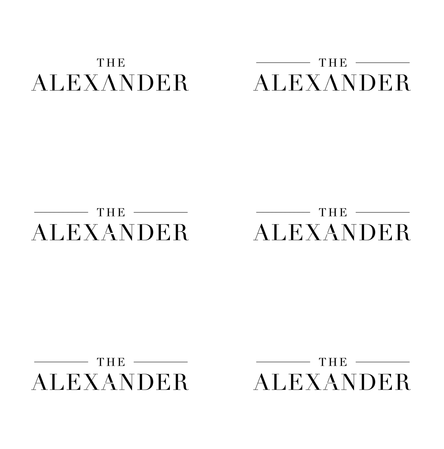
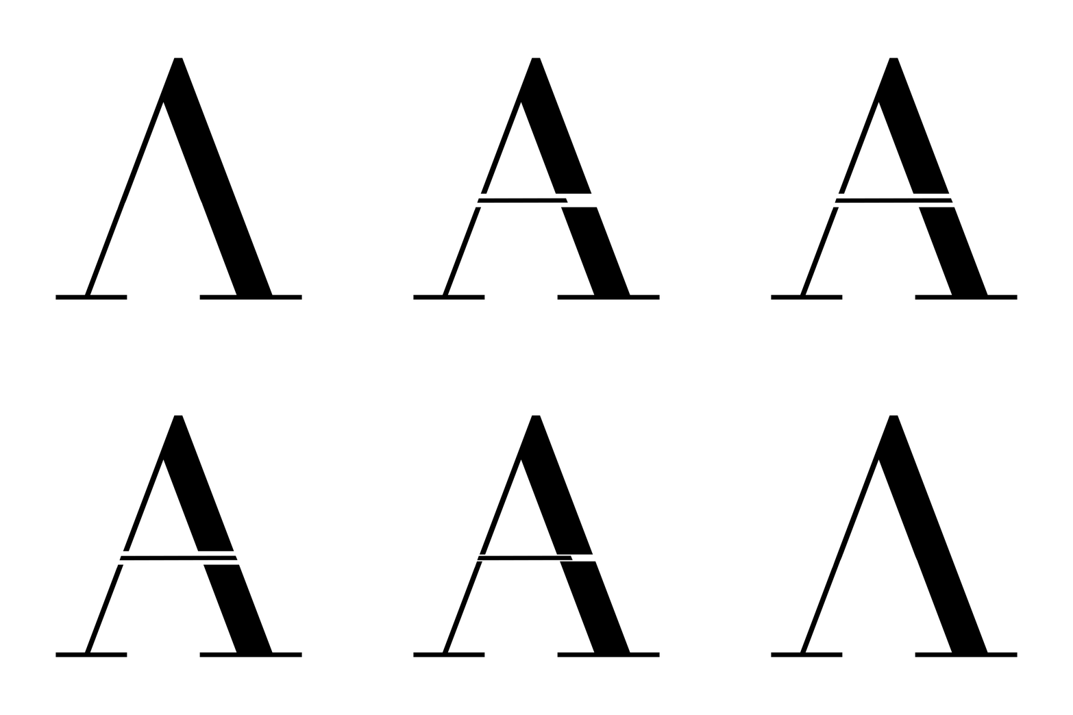
The logo implements a clean, serif typeface that boasts both elegance and class. A line striking through the center "A" creates a unique identity, translated through motion to emphasize the uniqueness within the logotype.
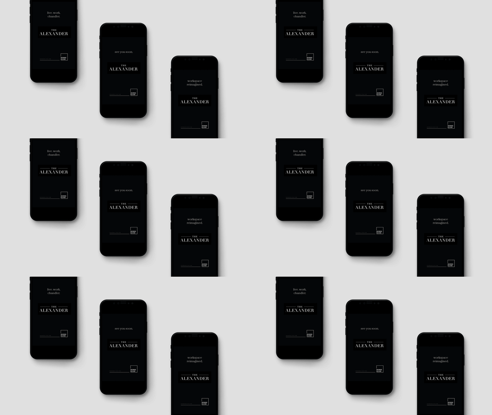
The brand is translated across a series of multi-channel graphic executions, including email marketing, outdoor signage, and wayfinding.
website
Once the logo and brand identity was established, I designed and developed a website to showcase the coworking spaces. This website was designed mobile-first within Adobe Illustrator, and developed using Wordpress.
This website provides a platform to excite business owners interested in leasing space within the trendy and stylish sister coworking spaces.
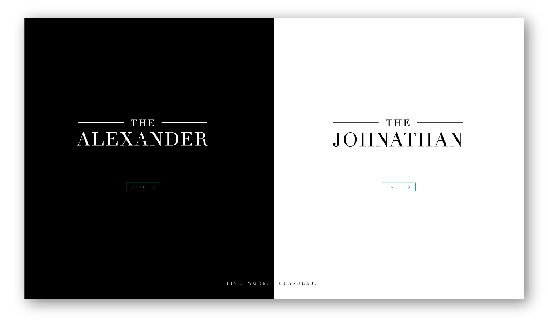
A minimalist landing page is split between the two spaces. The user is invited to navigate to either The Alexander or The Johnathan's pages. Within each page is a 3D tour and photo gallery of the space, icons to showcase the amenities, and information about what makes the location so prime.
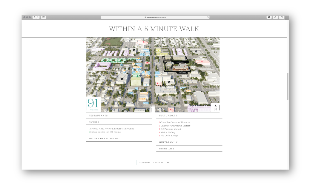
The Alexander's biggest selling point is its prime location in the heart of Chandler, Arizona. The Chandler page is designed to showcase the benefits of this location with an interactive map for the user to explore and filter restaurants, culture and night life in relation to the building's location.
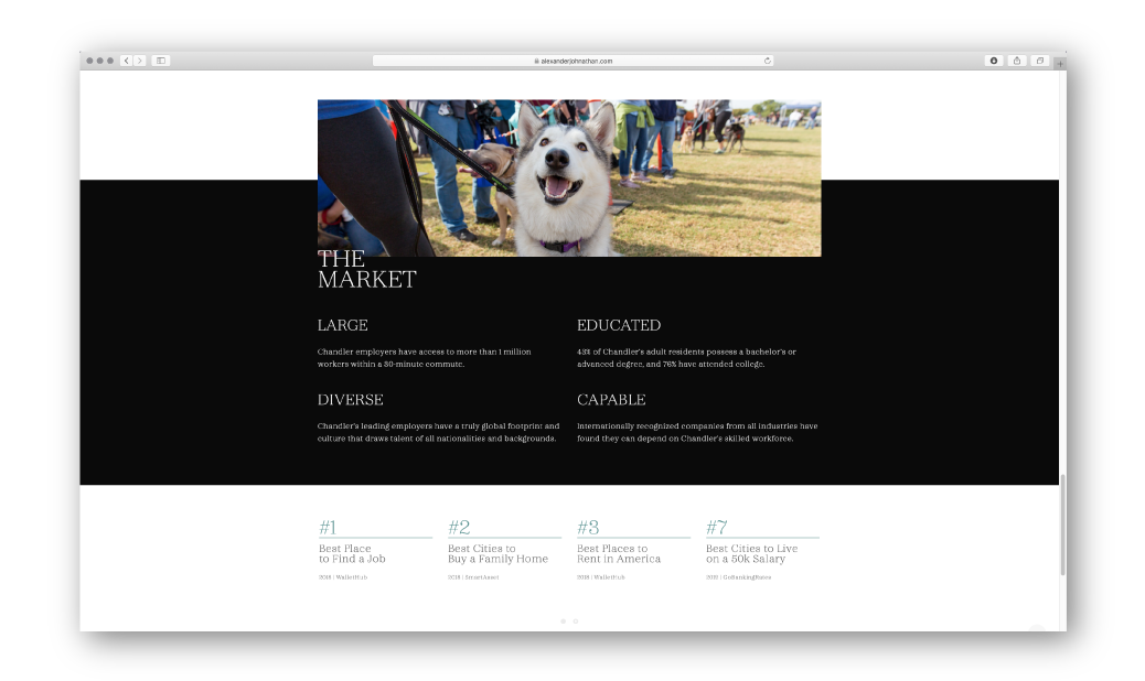
The benefits of living in Chandler are vast, and this website provides a resource for information on demographics and awards given to the city.
