experiential design | branding
underground dissent
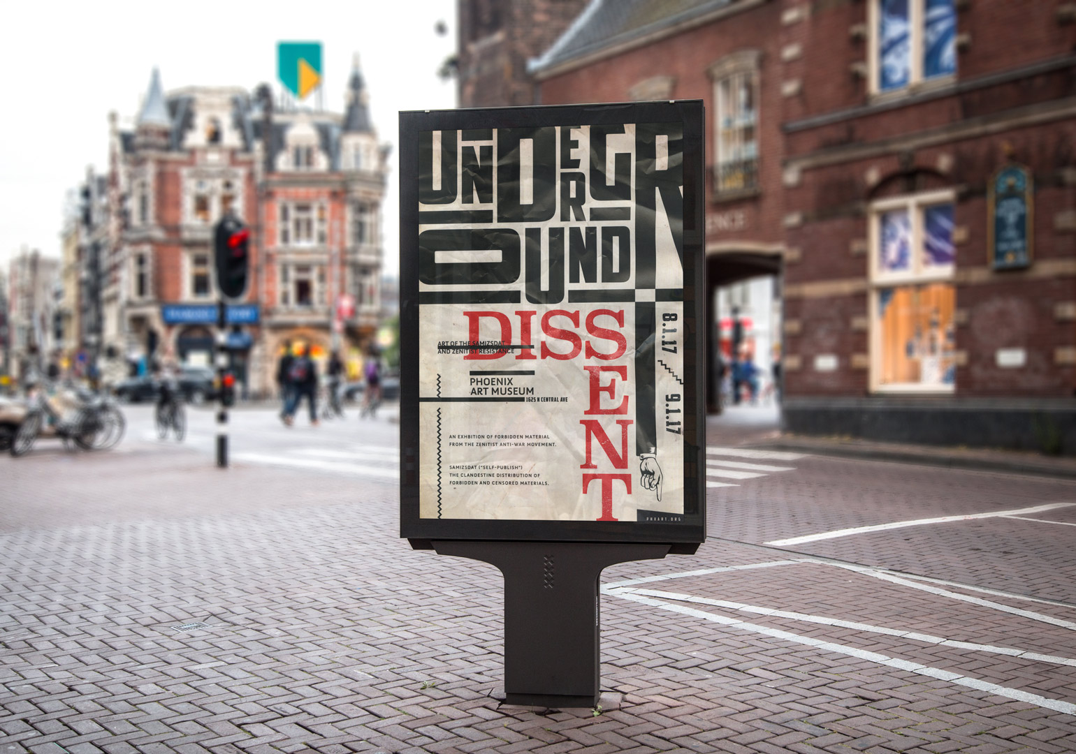

For a school project, I was assigned to design a museum exhibit and branded collateral for any topic of my choice. I researched, organized and designed a museum exhibition displaying the work from 1920’s post-war avantgarde movements in Yugoslavia and Russia.
My project was selected for Design Excellence by Arizona State's Herberger Institute for the Arts, and my work was displayed in a showcase of exemplary work from the design school.
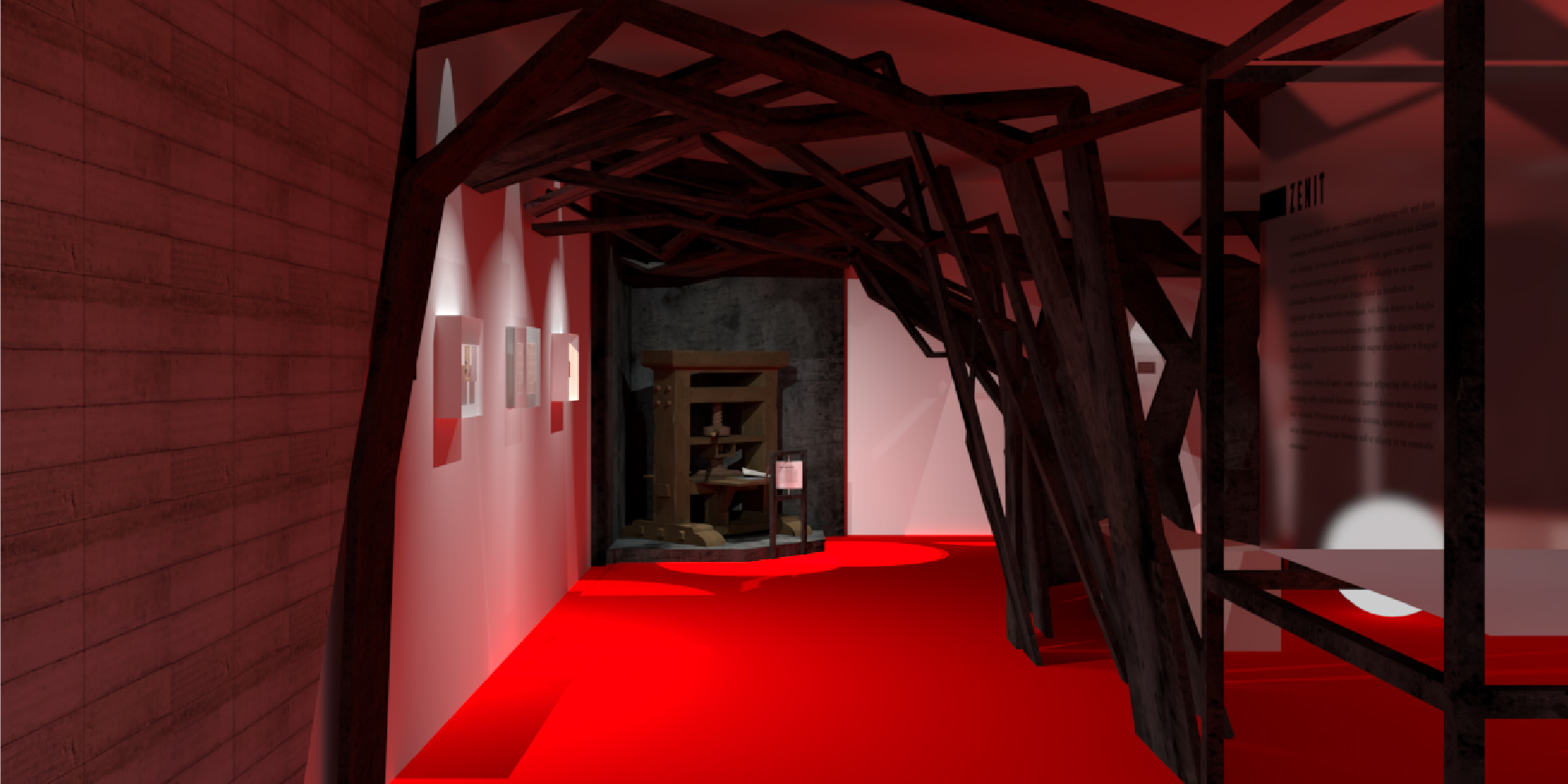
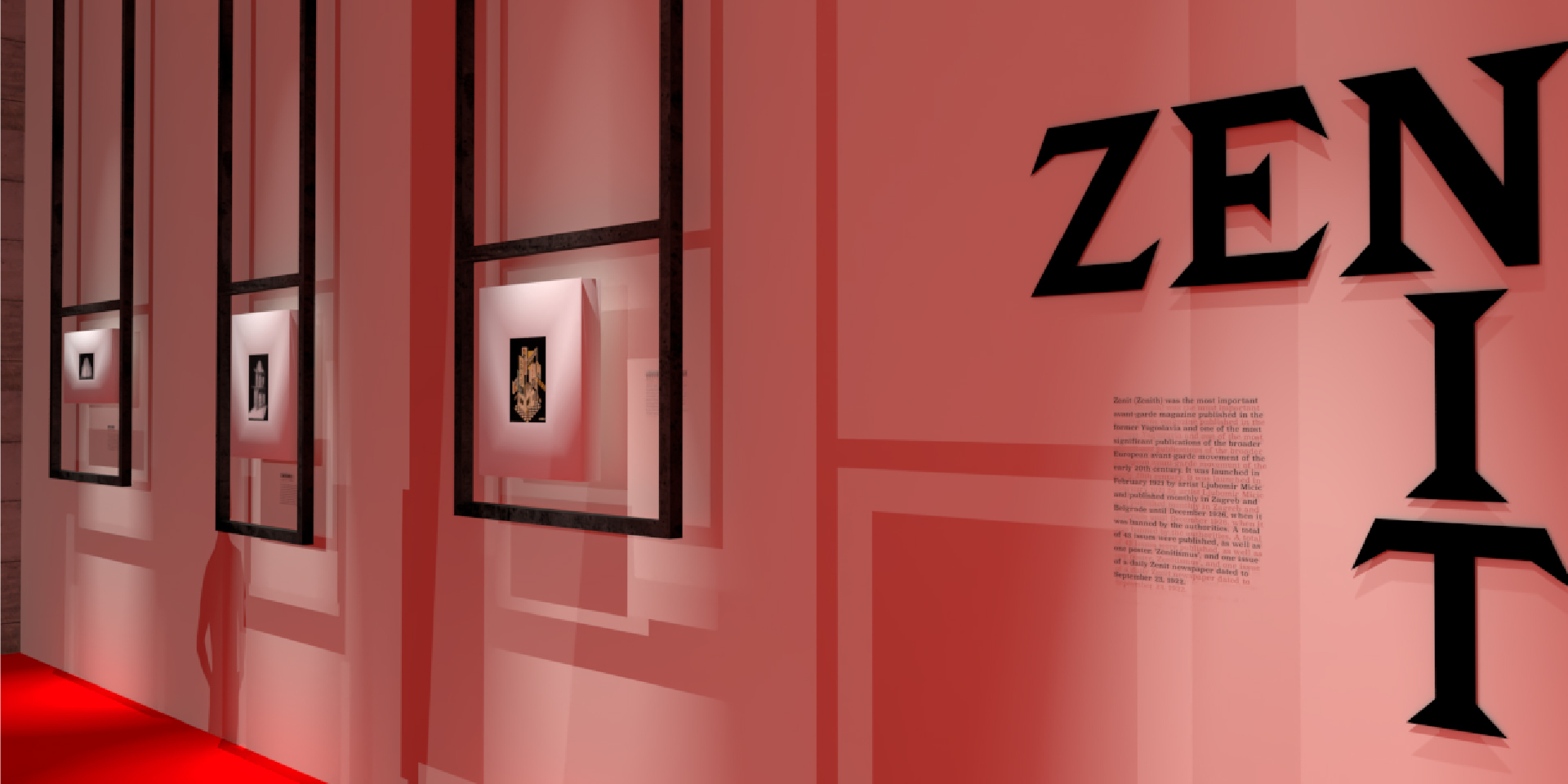
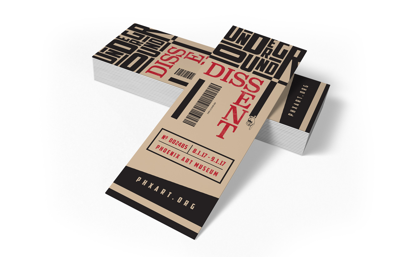
Branding and design of the exhibition was inspired by the design styles from Zenit, an underground publication highlighted on one wall of the exhibition, as well as the design styles of propaganda art from the war period.
The bold colors and dramatic typography help to convery the language of the region's brutal recent history to life with a shocking immediacy and quiet rage.
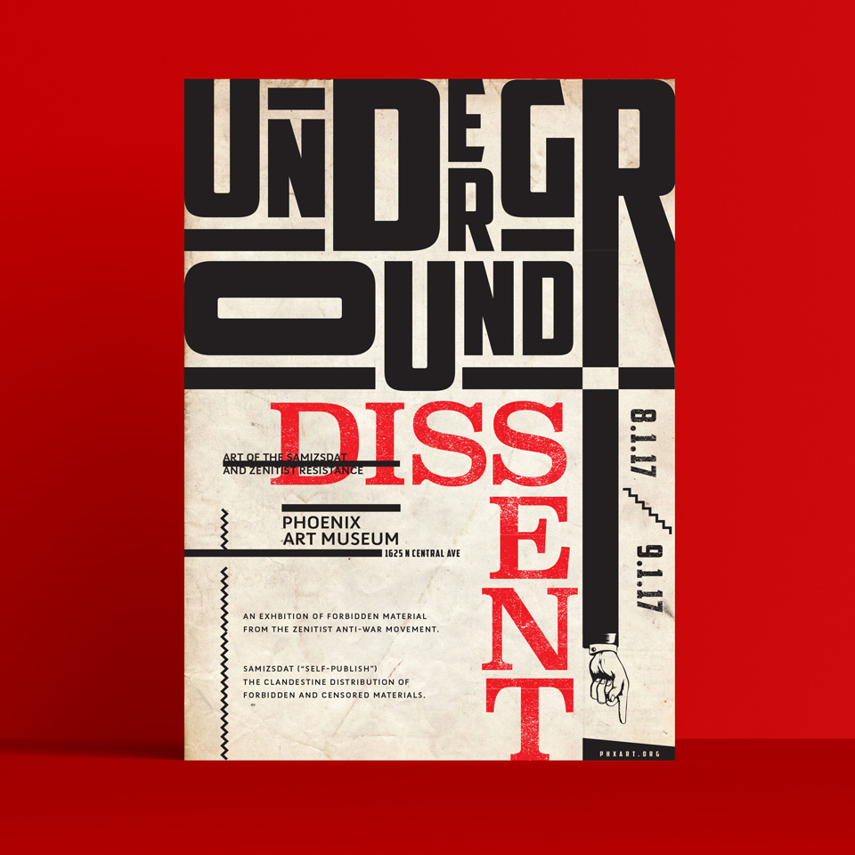
Samizdat, Russian for “Underground press”, refers to the illicit manufacturing and distribution of forbidden materials and is also used to describe works of art that would be considered dangerous to publish. Vladimir Bukovsky summarized it as follows: "Samizdat: I write it myself, edit it myself, censor it myself, publish it myself, distribute it myself, and spend jail time for it myself.”
Zenitism is a Yugoslavian avant-garde movement mainly involved in visual arts, graphic design, poetry, literature, theatre, film, architecture and music. Like other avantgarde movements at the time, it held anti-war, anti-bourgeois and anti-nationalist views and rejected traditional culture and art.
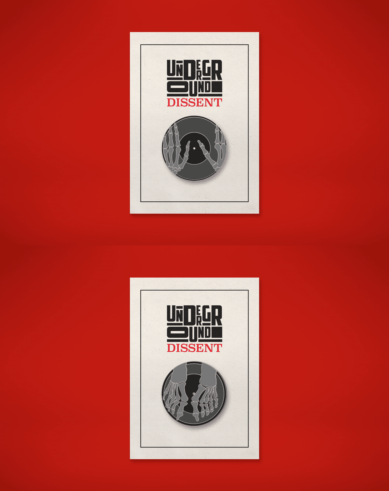
Pins inspired by "bone records", vinyl made from x-rays. Original copies were displayed in the exhibition.
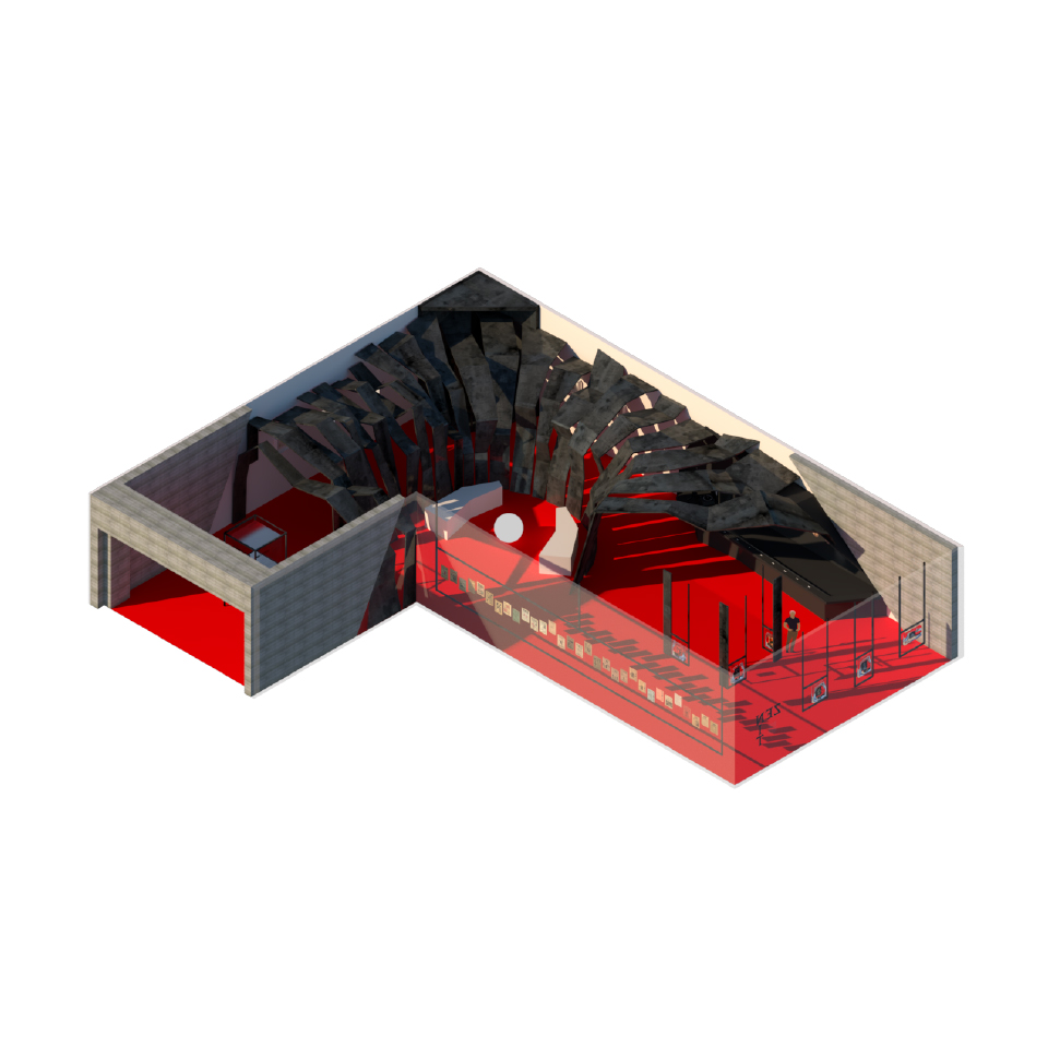
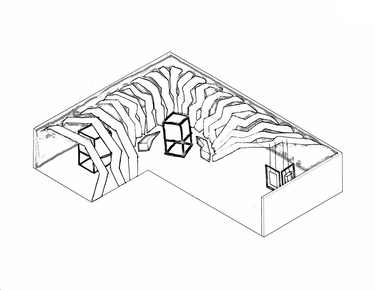
Predefined dimensions were specified, but layout of the exhibition was completely open.
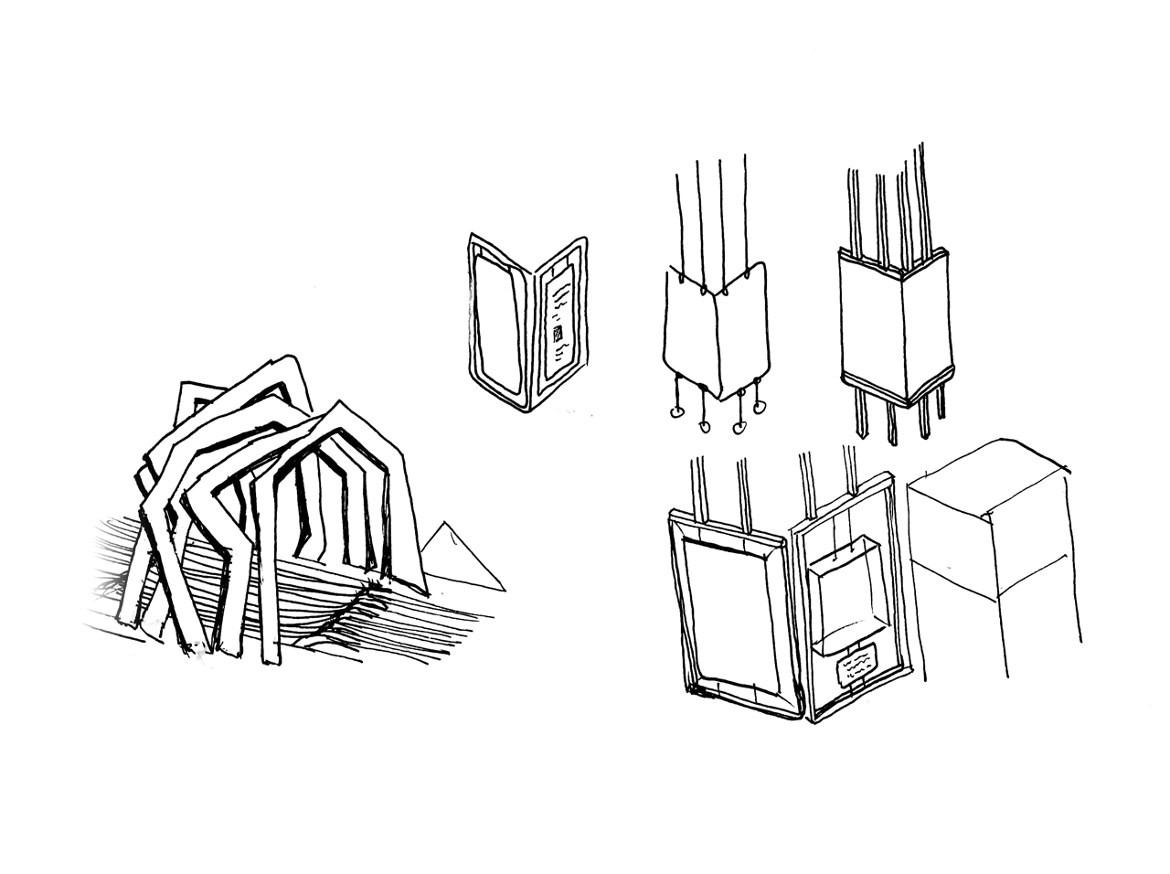
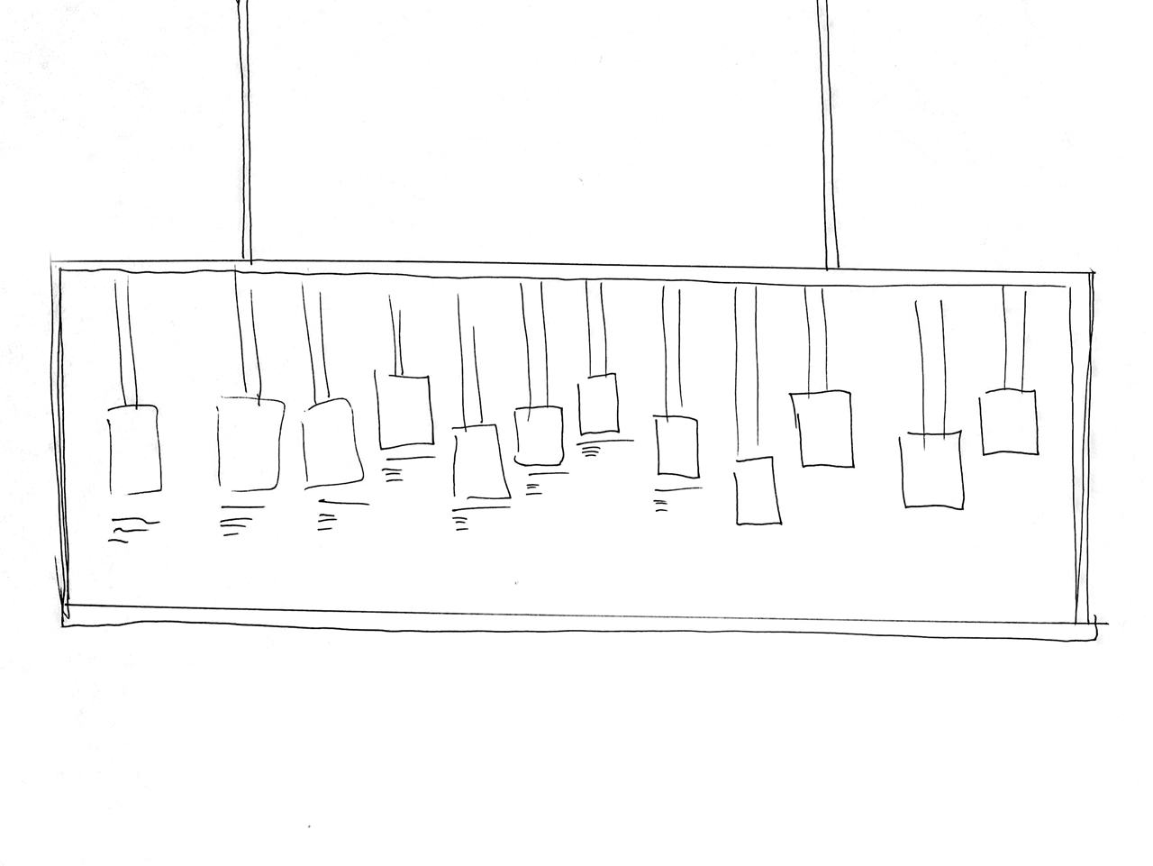
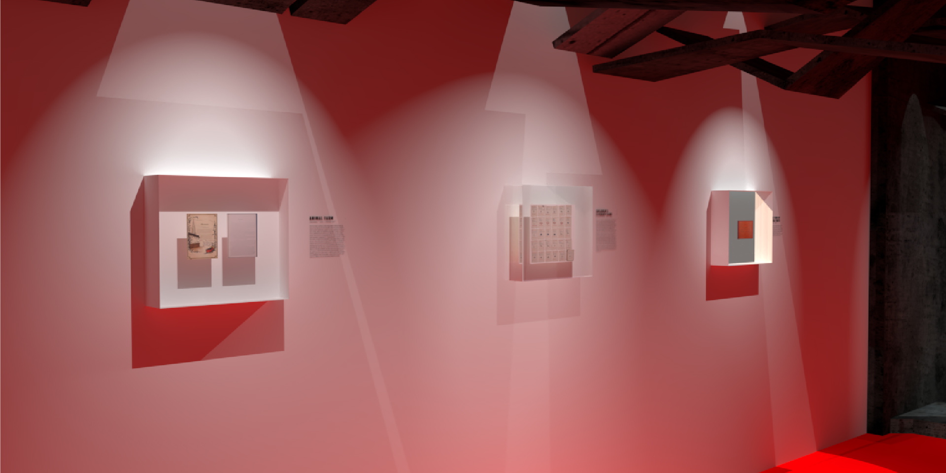
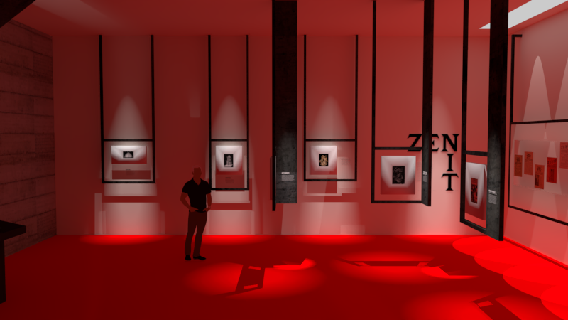
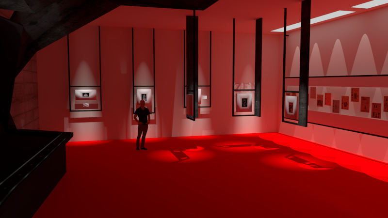
A tunnel comprised of jagged metal leads the viewer through the exhbition, where various of pieces of work and materials from the underground, anti-government movement are displayed in glass casings. Excerpts from the Zenit publication hang from the ceiling, playing with the light to create dramatic shadows. On the far wall, cover artwork from each year's publication is in displayed in a glass timeline.
